Tuesday, November 20, 2012

Geography 7 Lab 7


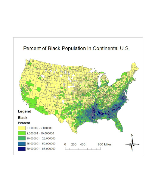
     The map above depicts the distribution of the "Black" population throughout the continental United States using Census data from the county level. As seen on the map, the "Black" population is predominantly found in the Southern States, a consequence of our slavery practices in the past.  In fact, the "Black" population is the majority (50%+) in many counties in the southern region. Along with some northern migration, the "Black" population has significant presence in Florida and Texas. The state of Michigan also contained a significant presence of "Black" population. Except for a presence in southern and central California, the "Black" population is scarce in the West. 
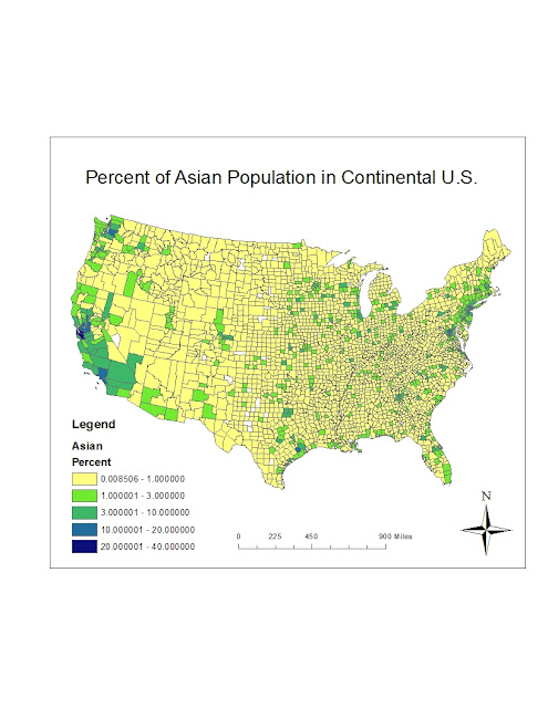
     The map above depicts the distribution of the "Asian" population throughout the continental United States using data from the U.S. census at a county level. As the map illustrates, the Asian population is predominantly located on the West Coast, especially in California. Although there is an Asian presence throughout the entire California, there are very few counties with at least 10% Asian population. There is, however, a county with over 20% Asian population in northern California. The Asian population also has a presence in northern Oregon and Washington. Other than a significant presence on the West Coast,there is a region of significant Asian population in the Northeast as well.
     The map above depicts the distribution of the "some other race" population in the continental United States, based on county level data from the U.S. Census. The map shows that there is a strong presence of "some other race" populations throughout the West and Southwest but there is little to no presence of "some other race" populations on the Eastern half of the United States. California has a strong presence of "some other race" populations, with several counties having over 25% populations. New Mexico and Texas also have widespread presence of "some other race" populations. Both states have many counties with at least 15% and some with over 25% of the population. If there is any significant region with "some other race" populations east of Texas it would be Florida. Although the density is only 3-7% , there is a good portion of the state with a presence of "some other race" populations. 

     My experience throughout this lab was very pleasant. Although there were some technical things to learn along the way, the overall product was very impressive. Once you lean how to save and add data sets it is pretty amazing what you can do in a relatively quick manner. This lab has further demonstrated the immense potential of ArcGIS. The ability to change breakpoints for the data in order to better illustrate distribution was very helpful and useful in order to demonstrate differences between regions. The use of different color ramps was also very helpful in visually demonstrating the differences among regions. When provided with data sets such as those developed by the U.S Census, ArcGIS is extremely capable of mapping that data and illustrating patterns throughout regions.

Monday, November 19, 2012

Geography 7 Lab 6


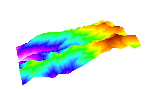
The area that I selected is found within the Mount San Antonio area. The area consists of mostly mountain grounds and a stream called "Fish Fork" that eventually connects with the San Gabriel River. The extent of the data I downloaded is (34.277N, 117.724W) and (34.327N, 117.631W). The geographic coordinate system is the GCS North American (1983) and the datum is North American (1983). I chose this area because I wanted to map an area with a variety of elevations, as seen in the 3-D image.

Monday, November 12, 2012

Geography 7 Lab 5

*Measurements will be listed as Geodesic / Loxodrome / Great Elliptic 

Lab #5
 

1) Cylindrical Equal Area (Sphere): 11,136,432 / 13,025,008 / 11,136,432

2)Cylindrical Equal Area (World): 11,159,983 / 13,055,122 / 11,159,992

As we see in these first two projections, equal area projections such as these preserve the amount of space between features on a map and preserve the size of land masses on a map. Using the graticule we can see that in both maps the area has been preserved, although some distortions do exist. For example, when comparing the distance between Washington D.C. and Kabul, Afghanistan in the two projections, we can clearly see that  distance has not been preserved. Regardless of which form of measurement you use, we can see that the second projection increased the distance between the two cities every time.
 
3) Sphere Equidistant Cylindrical: 11,136,432 / 13,025,008 / 11,136,432
4) Sphere Equidistant Conic:         11,136,432 / 13,025,008 / 11,136,432

When looking at the two projections above it is clear that equidistant projections do not preserve a maps shape or area. The continents are different shapes and sizes in the two maps. "Equidistant" projections, however, do preserve the distance between point on a map. As seen through the measurements above, the distance between Washington D.C. and Kabul, Afghanistan is the same in both maps. Although these projections look very different because one is cylindrical and one is a conic, these are both examples of equidistant projections because they preserve distance.

5) USA Contiguous Lambert Conic: 11,159,983 / 13, 055,122 / 11,159,992
6) Europe Lambert Conic:                 11,160,469 / 13,055,701 / 11,160,478

The two maps above are examples of conformal map projections, which preserve shape by keeping the angles of feature boundaries like the countries on these maps. As you can see above, the shapes of the continents in both maps is preserved, this is the objective of conformal projections. However preserving shape is not the same as preserving size, conformal maps can cause countries and other map features appear larger than their spatial equivalent, even though the country would still have the same shape. As seen in the measurements above, the different conformal projections did not distort distance. Although the measurements are not identical, the difference is very minimal.

Significance, Perils, Potential

Map projections are definitely significant because they are necessary to understand how to read a map. If you are not aware of the map projections you are using, you will not know which features of reality are being distorted and which are being preserved. Without knowledge of map projections, someone might foolishly use an equal area projection to measure distance. Their significance is also their peril. As a result of the immense impact that map projections have on the presentation of data, map projections could greatly alter reality in a map. The simple fact that every map projections distorts an aspect of reality is a peril, no matter what projection you use either distance, area, or shape will be distorted and therefore deceiving to unknowing viewers. These perils, however, are minimal and manageable when compared to the potential of map projections. The ability of map projections to express three-dimensional data on a flat surface while still preserving aspects of reality is an amazing feature. Although some may focus on the fact that every projection distorts, we cannot forget that every projections preserves. Map projections not only allow you to transfer three-dimensional data onto a flat surface, but they can also guarantee to preserve area, shape, or distance with different projections. The fact that certain projections distorts is not a problem, we simply need to inform viewers of what the map is preserving and direct viewers to focus on those aspects. Even though equidistant map projections may come in a wide variety of shapes and sizes, if viewers understand the map is preserving distance, they can will know how to interpret the map. The process of this lab has definitely showed me the importance and potential of map projections.

Monday, November 5, 2012

Lab 4


In this lab we used the ArcGIS system for the first time. The process of using the ArcGIS system was very confusing for me. It took several steps to complete some simple functions like changings fonts and colors. I do not have any experience working with software like this and therefore it took a long time to complete each exercise. I also found it very easy to click the wrong button or make a slight mistake that dramatically changed the map, which was unfortunate for a first-time user like myself and further prolonged the process. Another pitfall in my experience was the fact that the tutorial was for a different version of the system and therefore you couldn’t do some of the functions unless you looked at a different document and tried to make sense of it. I think it would have beneficial to go through the packet in lab as a class, therefore making sure everyone understands the material.
I think this lab would have been much more tolerable if we were given more time to work with the program. Although you can eventually get through the tutorial as a first-time user, it is very difficult to remember exactly what you did and how you did it because we were simply following instructions from a sheet of paper. I think with more practice we can begin to learn the basic features of ArcGIS and this process would be much more pleasant. I would note however that most programs are extremely painful to work with at first and these are pitfalls that might be unavoidable for any first-time user.
With all the confusion and frustration that came from using a new program, once I completed the exercise I was impressed with all the functions that it could perform. The ability to demonstrate different geographic features, create tables, and produce highly informative maps is very useful in a variety of academic fields. The functions that we learned were just the basics of the system and I still couldn’t believe what the program was capable of doing. I think the ArcGIS is full of potential and is likely to get better and better with technological advancements over time.
My experience with neogeography in lab 3 and now the basic functions of ArcGIS clearly reveal the tradeoff of easy-use and high functionality. Neogeography was limited in its functions and ability to represent data but was extremely easy to use. My experience with neogeography was much more pleasant and I was able to understand the end result fully. ArcGIS provided the tools to complete amazing functions and produce extremely informative maps that neogeography would never allow, but at a huge cost, the program was no longer user-friendly. I think ArcGIS is extremely technical and is not useful for average people. This system is full of potential but its use is limited to the academic/scientific community.

Tuesday, October 16, 2012

Geography 7 Lab 3


View Spain Study Abroad Trip in a larger map


Neogeography refers to a new, informal form of geography that is rapidly developing today. Tools such as MapQuest and Google Maps allow untrained individuals to make maps using a variety of existing tools. Neogeography has much potential because it does not require prior map-making knowledge. An untrained person like me can create a map of a hiking trip or a vacation in Europe as I did above. It was the first time I had made a map and I was able to figure it out pretty easily. Furthermore, features such as adding photos, videos, or links to places on a map can be very helpful in the organization of information. As seen on my map, using neogeography I was able to not only map various locations that I visited but I was also able to give an address, a description of the place, a photo/video, and links for further information. This allows for great organization and can be very helpful for others interested in visiting those areas. Neogeography is full of potential, as new features become available and current systems are improved, neogeography will also improve.
Although neogeography has much potential, it is not without its pitfalls. Because neogeography is intended for untrained users, the potential for error is extremely high. Not only could someone purposely deceive others with misinformation, but someone may also accidently misreport information because of improper use of features or simply a mapping mistake. Although neogeography is intended for untrained map-makers, there is still some training required to make use of all features. Many people may not be aware on how to attach a photo or video onto a map and they may make a mistake. Furthermore, the programs themselves and the tools within may lead to certain errors. Although it may not be common, map making sites occasionally make errors on the locations of places. For example, although Google Maps allows you to search a place by name in order to find the address, at times the address given is outdated or incorrect. In conclusion, neogeography has provided average people with great tools to organize information and create valuable maps, however, human deception, human error, and system errors all pose threats to the validity and quality of these new maps.

Tuesday, October 9, 2012

Geography 7 Lab 2

Lab 2 Answers

1.The name of the quadrangle is Beverly Hills Quadrangle.

2.The names of the adjacent quadrangles are: Canoga Park, Van Nuys, Burbank, Topanga, Hollywood, Venice, and Inglewood.

3.The quadrangle was first created in 1966.

4.North American Datum of 1927 (NAD27) and North American Datum of 1983 (NAD83)

5.The scale of the map is 1:24,000, which means that one inch on the map is equivalent to 24,000 inches on the ground.

6a. 5 centimeters on the map is equivalent to 1200 meters on the ground.
6b. 5 inches on the map is equivalent to about 1.9 miles (10,000 feet) on the ground.
6c. 1 mile on the ground (5,280 feet) is about 2.64 inches on the map.
6d. 3 kilometers (3,000 meters) on the ground is equivalent to about 12.5 centimeters on the map.

7. The contour interval of the map is 20 feet.

8a. Public Affairs -
(34 degrees, 4', 25"N), (118 degrees, 26', 20"W)   OR   34.073611N,-118.439W
8b. Tip of Santa Monica Pier -
 (34 degrees, 0', 25"N), (118 degrees, 30', 0"W)   OR    34.006944N,-118.5W
8c. Upper Franklin Canyon Reservoir -
(34 degrees, 7', 10"N), (118 degrees, 24', 30"W)   OR    34.119444N ,-118.408333W

9a. Greystone Mansion, 580feet/177meters
9b. Woodlawn cemetery, 140 feet/ 43 meters
9c. Crestwood Hills park, 580 feet/ 177 meters

10. UTM Zone 11


11. 361500 meters E, 3763000 meters N


12.(1,000 x 1,000) = 1,000,000 square meters

13. Elevation Profile          

**UTM 366000m E (520) and UTM 367000m E (440) are both located on UCLA campus.

14. The magnetic declination is 14 degrees E

15. The stream flows from North to South

16.

Tuesday, October 2, 2012

Geography 7 Assignment 1 (J.Vallejo)


This map can be found using the following link, (http://www.creativeclass.com/_v3/creative_class/category/creative-class-consumption/page/2). Although the map was found on the creativeclass.com website, the map is from a source known as Strange Maps. The map attempts to display the "Best Beer in America" geographically. The darker states refer to states in which the most medal-winning beers were won, while the lighter states have the least medal-winning beers. With 474 medals, this map would indicate that California has the best beer in America. Other than the fact that it discusses beer, I found this map interesting because of the geographic approach. They are not interested in which beer is the best, but rather where the best beer is located. The data is based on results from the Grand American Beer Festival, which clearly has an influence on the map since it is the opinion of this one festival which determines the medal winners. Furthermore, this map may have been more helpful if it accounted for the worst beer as well. Although it may be difficult, creating some sort of deductions for bad beers will give a better illustration of the best state(s) for beer. If only successful beers are accounted for, larger states will have the advantage (more opportunities to succeed without punishment for failure).


This map can be found on the following link - (http://bigthink.com/strange-maps/308-the-pop-vs-soda-map). I found this map on the Strange Maps website although it was produced by Matthew T. Campbell of East Central University (Oklahoma) as indicated on the map itself. This map illustrates the regional variations (by county) in the use of generic names for soft drinks. The map illustrates what percentages of a certain regional population use the term "pop", "coke", "soda", or "other" to refer to soft drinks. I found this map interesting because I personally use the term "soda" and was curious how other regions vary in there usage. I was surprised to see that "soda" is not the most dominant term used across the United States. Furthermore, although I had heard the term "pop" before, I was further surprised to see that the term "coke" was so prevalent in the South. The article indicated that this phenomenon may be explained by the fact that Coca-Cola was originally manufactured in Atlanta, Georgia. Lastly, I found it interesting that there is a significant portion of Missouri and Illinois that use the term "soda" 80-100% when they are surrounded by "pop" and "coke" usage.

 
This map can be found on the following link  - (http://bigthink.com/strange-maps/297-the-south-shall-snack-again). I found this map on Strange Maps but the original location is indicated as frostfirezoo.com on the article. This map illustrates the percentage of adult obesity by state over a three-year period (2005-2007). The map indicates that Colorado is the "leanest state", with the lowest percentage of adult obesity (18.4%) and that Mississippi is the "fattest state", with the highest percentage of adult obesity (31.6%). I found this map interesting because the subject matter was interesting. I have never seen data on obesity rates and I was curious how California compared to the rest of the country. I was surprised to see that more than half of U.S. states have higher obesity rates than California. Furthermore, it was both surprising and frightening to think that about 1/4 of adults in each state were obese. Given that the data is about 5 years old I hope that these numbers have improved.